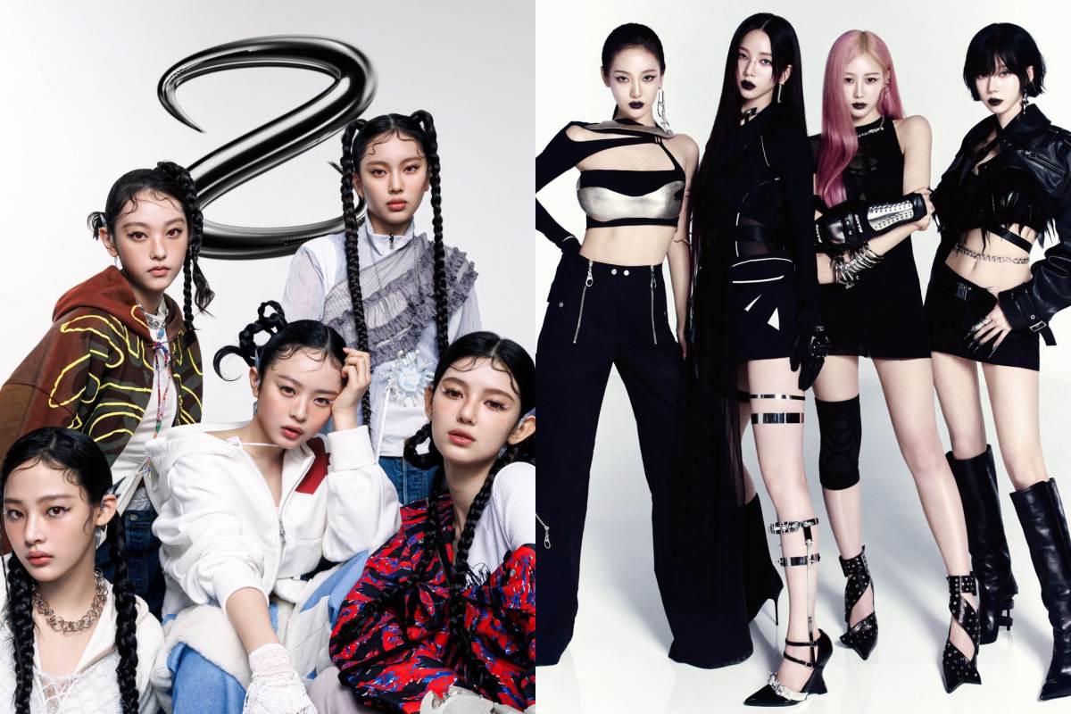
The newly rebranded NJZ, formerly known as NewJeans, has unveiled a metallic logo that’s provoking online chatter. Some fans are debating whether NJZ’s new eye-catching chrome aesthetic was copied from aespa’s signature cyberpunk style. The controversy ignited as soon as NJZ dropped their teaser visuals, which feature scratched-metal graphics and futuristic vibes.
NJZ 🤝🏻 aespa logo#NJZ #NewJeans #aespa #Jeanz pic.twitter.com/cv6EXMCaoN
— pyramids njz (@PyramidsTV) February 7, 2025
Despite the online controversy, many supporters argue that metallic and futuristic elements are far from exclusive to any single K-pop group. They point out that bold design choices—like reflective lettering—are common in global music and fashion scenes. While some netizens are talking about plagiarism, others believe it’s all part of NJZ’s evolution and have said that aesthetic choices tend to overlap.
Meanwhile, NJZ is scheduled to have their first performance under their rebranded image at ComplexCon Hong Kong 2025. Fans are eager to witness the group’s transformation and see if NJZ’s new style actuallly mirrors aespa or stands apart as something unique. Either way, the spotlight is shining bright on NJZ, and their new moves are getting louder.


